At Lily's birthday party today (pics to come), I realized many people in our family had never seen the before photos of our house. One of my friends said that I should make a coffee table book. That would take some more time and finding the old photos of everything, which I'm hoping are on my old computer. But anyway... here are some photos from the house before I got my hands on it!
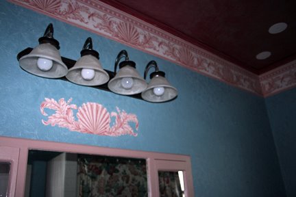 |
| BEFORE - the hallway bath. Brick red ceiling, aqua blue walls, shell border around ceiling and cut out detail, pinkish tan painted trim, tile halfway up walls, wallpaper on ceiling. |
 |
| BEFORE - old bath area in front of window was converted to shower area too (with the new "wall" to house shower pieces. |
 |
| BEFORE - bathroom - circle medallions match those found in dining room (all cut out of larger wallpaper pieces). |
 |
| BEFORE - columns in living room. Two tone with glaze. |
 |
| BEFORE - living room into dining room (house is a mess while painting started). The living room had already been painted, dining room is still a dark red. |
 |
| BEFORE - dining room side was solid brown with glued on decals. |
 |
| BEFORE - living room - "antique" (according to previous homeowner), wallpaper (that's the sheet that was cut out for all borders and circle medalions), corner pieces from wallpaper, hand painted border (wallpaper), dark red (with black glaze) walls, brownish ceiling. |
 |
| BEFORE - dining room - just another shot of the darkness and random details. |
 |
| BEFORE - dining room - showing off the hand painted (NOT by me!) wallpaper border. |
 |
| BEFORE - that's a lot of work - glad it didn't take much to remove it all! |
 |
| BEFORE - dining room - wallpaper on trim. Why?!?! |
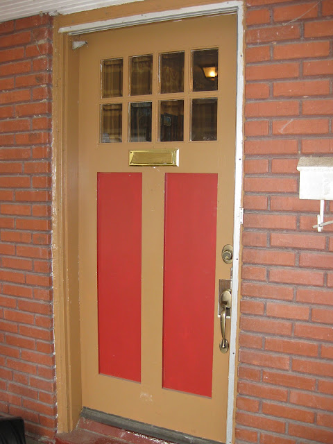 |
| BEFORE - door. The true before would show the old hardware, but we replaced that for a new lock and dead bolt within weeks of moving in. Security first people! |
 |
| BEFORE - kitchen - OMG was this bad! And yes, those are grapes that are climbing up to the ceiling. |
 |
| BEFORE - kitchen - oh the green ... |
 |
| BEFORE - kitchen - up close - and in progress, the black is just a temporary fix until we can afford a true makeover |
 |
| BEFORE - Lily's room - two closets, poop brown trim, stenciled gold medallions |
 |
| BEFORE - Lily's room |
 |
| BEFORE - Lily's room detail of the stencils on the walls |
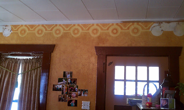 |
| BEFORE - living room - dark brown trim, mustard walls (with glaze), wallpaper (hand painted again), two color door, "ornate" (?) switch cover, dark green curtains with tassels. |
 |
| BEFORE - living room - wall paper on ceiling |
 |
| BEFORE - living room |
 |
| BEFORE - living room - trim on bottom and top of walls. Green thing with strings is the curtain and the tie back (that's looped up so I can start cleaning and removing wallpaper). |
 |
| BEFORE - living room - window decorations |
 |
| BEFORE - fireplace |
 |
| BEFORE - living room - more wallpaper! |
 |
| BEFORE - upstairs office (look at the belly!!!) |
 |
| BEFORE - our garden area |
 |
| BEFORE - was after - of garden area (and also pre-fence too) |
 |
| BEFORE - upstairs - two different colors of trim, wood trim everywhere (instead of properly finishing drywall), wood paneling on vertical surfaces |
 |
| BEFORE (kinda) - upstairs. This shows teh color, wood trim, stair carpet, brick walls that were on all four eaves |





6 comments:
Oh my sweet goodness! Those are some before pictures. I'm glad you guys had the vision to see past all of that. yikes. good job making everything so much better.
Whoa. What awesome is that the house has a lot of chartater, which is so cool. BUT holy smokes, the colors and walll paper, ewww. You def. have your work cut out for you!
I had forgotten some of the colors your house had when you guys bought it. The kitchen wallpaper was horrible and I recall how it felt like it was alive and draping down from the ceiling.
Sitting in your lovely living room yesterday and admiring how nice things look made me very proud of you hard work! Your house is beautiful!!
oh.my.lord. and you still bought the place? lol. those are some seriously amazing befores.
This looks so very Debbie Travis (tv decorator) when she was in her make things look medieval phase. I hope you got the house for a good price. It's a lot of work, but it looks like you have a good start at finding the house under that hot mess.
lol just found your blog & let me tell you that is scary! VERY SCARY!!! next going to look at what you did to remodel! Even if you painted top to bottom white it would be better! lol
Post a Comment